CSS – Border
Certainly! In web design, CSS (Cascading Style Sheets) provides the ability to apply borders to HTML elements, allowing you to enhance the visual appeal and structure of your web page. Borders are a fundamental design element that can be customized in several ways. Here’s a breakdown of CSS borders:
1. Border Width (border-width):
CSS allows you to specify the width of borders. You can use values like thin, medium, thick, or specific measurements like pixels (px) or other units.
You can control the border width of HTML elements using the border-width property in CSS. Here’s an example of how to set the border width for a <div> element:
<!DOCTYPE html>
<html>
<head>
<style>
/* CSS styles for the div element */
.border-div {
width: 200px;
height: 100px;
border: 2px solid #336699; /* Set a border with a width of 2px */
}
</style>
</head>
<body>
<div class="border-div">This is a div with a border.</div>
</body>
</html>Code language: HTML, XML (xml)Output :
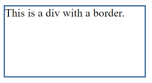
In this example:
- We define a CSS class called
.border-div. - Inside this class, we set the
borderproperty to2px solid #336699, which creates a border with a width of 2 pixels and a solid blue color (#336699). - The
<div>element with the class.border-divhas this border applied.
You can adjust the border-width property to specify the desired width for your border. It can be set in pixels, ems, rems, or other valid CSS units, depending on your design requirements.
2. Border Style (border-style):
You can define the style of the border, choosing from options like solid, dotted, dashed, double, groove, ridge, and more.
You can control the border style of HTML elements using the border-style property in CSS. Here’s an example of how to set the border style for a <div> element:
<!DOCTYPE html>
<html>
<head>
    <style>
        /* CSS styles for the div element */
        .border-div {
            width: 200px;
            height: 100px;
            border: 2px solid #336699; /* Set a border with a solid style */
        }

        /* CSS styles for a different div element with a dashed border */
        .dashed-border-div {
            width: 200px;
            height: 100px;
            border: 2px dashed #ff6633; /* Set a border with a dashed style */
        }
    </style>
</head>
<body>
    <div class="border-div">This is a div with a solid border.</div>
    <div class="dashed-border-div">This is a div with a dashed border.</div>
</body>
</html>Code language: HTML, XML (xml)
Output :
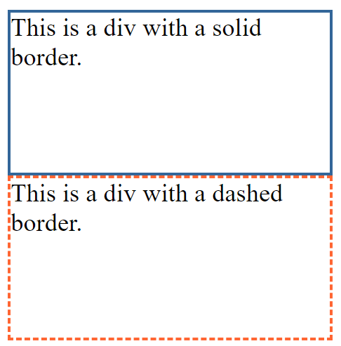
In this example:
- We define two CSS classes:
.border-divand.dashed-border-div. - For
.border-div, we set theborderproperty to2px solid #336699, which creates a border with a solid style. - For
.dashed-border-div, we set theborderproperty to2px dashed #ff6633, which creates a border with a dashed style and a different color.
Both <div> elements have borders applied with different styles. You can adjust the border-style property to specify other styles like dotted, double, groove, ridge, inset, outset, or any other valid border style according to your design requirements.
3. Border Color (border-color):
- CSS allows you to set the color of the border. You can use color names, hexadecimal codes, RGB values, or HSL values.
- Example:
border-color: #0073e6;
4. Border Shorthand (border):
The border property combines the width, style, and color settings into a single shorthand declaration.
You can control the border color of HTML elements using the border-color property in CSS. Here’s an example of how to set the border color for a <div> element:
<!DOCTYPE html>
<html>
<head>
    <style>
        /* CSS styles for the div element */
        .border-div {
            width: 200px;
            height: 100px;
            border: 2px solid #336699; /* Set a border with a color of #336699 */
        }

        /* CSS styles for a different div element with a different border color */
        .colored-border-div {
            width: 200px;
            height: 100px;
            border: 2px solid #ff6633; /* Set a border with a color of #ff6633 */
        }
    </style>
</head>
<body>
    <div class="border-div">This is a div with a border color of #336699.</div>
    <div class="colored-border-div">This is a div with a border color of #ff6633.</div>
</body>
</html>Code language: HTML, XML (xml)
Output :
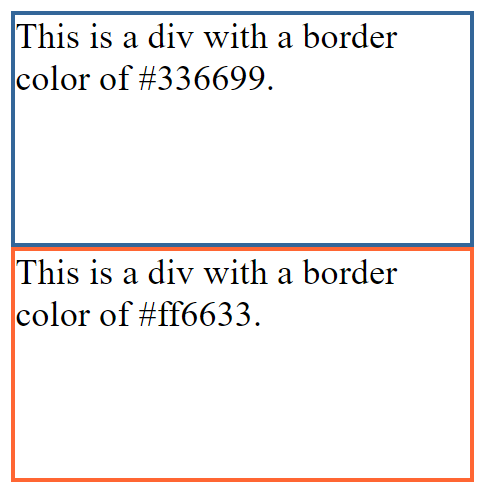
In this example:
- We define two CSS classes:
.border-divand.colored-border-div. - For
.border-div, we set theborderproperty to2px solid #336699, which creates a border with a color of#336699. - For
.colored-border-div, we set theborderproperty to2px solid #ff6633, which creates a border with a different color of#ff6633.
Both <div> elements have borders applied with different colors. You can adjust the border-color property to specify any valid color value according to your design requirements.
5. Border Radius (border-radius):
- CSS enables you to round the corners of elements using the
border-radiusproperty. It can create square, rounded, or elliptical corners. - Example:
border-radius: 10px;
6. Border Image (border-image):
You can use images as borders with the border-image property. This allows for highly customized border designs.
The border-image property in CSS is used to apply an image as a border to an HTML element. Here’s an example of how to use the border-image property on a <div> element:
<!DOCTYPE html>
<html>
<head>
    <style>
        /* CSS styles for the div element */
        .border-image-div {
            width: 200px;
            height: 100px;
            border: 10px solid transparent; /* Set a transparent border */
            border-image: url('border-image.png') 30 30 30 30 round; /* Apply a border image */
            padding: 20px; /* Add padding to create space inside the border */
        }
    </style>
</head>
<body>
    <div class="border-image-div">This is a div with a border image.</div>
</body>
</html>Code language: HTML, XML (xml)
Output :
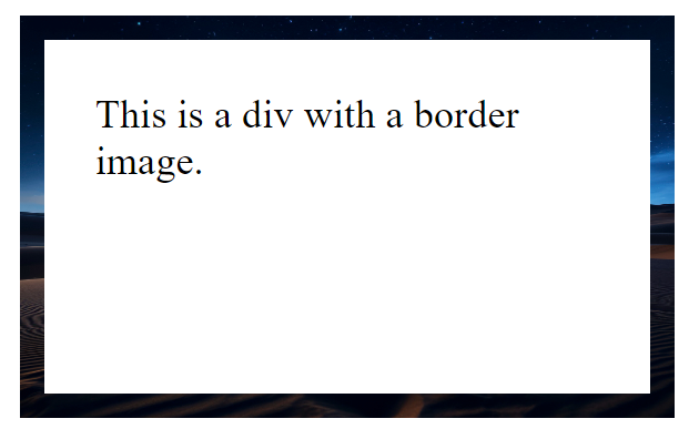
In this example:
- We create a CSS class called
.border-image-div. - For the border, we start with a
10pxsolid transparent border. - We use the
border-imageproperty to specify an image (in this case, ‘border-image.png’) that will be used as the border. The values30 30 30 30specify the slicing of the image (top, right, bottom, left) androundindicates how the image should be repeated to fit the border.
Make sure to replace 'border-image.png' with the actual path to your border image file.
This will apply the specified image as a border around the <div> element. You can adjust the border width, image path, and slicing values to achieve your desired border image effect.
7. Individual Border Sides (border-top, border-right, border-bottom, border-left):
CSS allows you to set different border properties for each side of an element.
You can set individual border styles for each side of an HTML element using the border-top, border-right, border-bottom, and border-left properties in CSS. Here’s an example:
<!DOCTYPE html>
<html>
<head>
    <style>
        /* CSS styles for the div element */
        .border-sides-div {
            width: 200px;
            height: 100px;
            border-top: 5px solid #336699; /* Set a border for the top side */
            border-right: 10px dashed #ff6633; /* Set a border for the right side */
            border-bottom: 15px double #99cc99; /* Set a border for the bottom side */
            border-left: 20px groove #663366; /* Set a border for the left side */
        }
    </style>
</head>
<body>
    <div class="border-sides-div">This div has individual border styles for each side.</div>
</body>
</html>Code language: HTML, XML (xml)
Output :
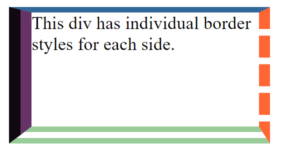
In this example:
- We create a CSS class called
.border-sides-div. - We set individual border styles for each side of the
<div>element using theborder-top,border-right,border-bottom, andborder-leftproperties. - Each border style includes the border width (in pixels), style (e.g.,
solid,dashed,double,groove), and color (specified as a color code).
This results in a <div> element with different border styles for each side. You can adjust the border properties, including width, style, and color, to create the desired appearance for your element.
8. Removing Borders (border: none;):
You can completely remove borders from an element by setting border to none.
To remove all borders from an HTML element, you can use the border property and set it to none. Here’s an example:
<!DOCTYPE html>
<html>
<head>
    <style>
        /* CSS styles for the div element */
        .no-border-div {
            width: 200px;
            height: 100px;
            border: none; /* Remove all borders */
            background-color: #f2f2f2; /* Add a background color for illustration */
        }
    </style>
</head>
<body>
    <div class="no-border-div">This div has no borders.</div>
</body>
</html>Code language: HTML, XML (xml)
Output :
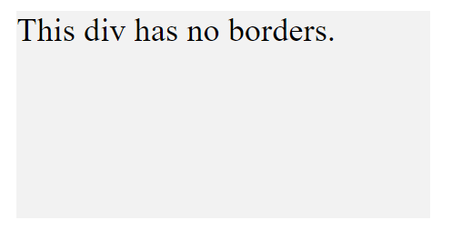
In this example:
- We create a CSS class called
.no-border-div. - We set the
borderproperty tonone, which removes all borders from the<div>element. - For illustration purposes, we also set a background color (
#f2f2f2) to make it clear that the borders have been removed.
This results in a <div> element with no visible borders. You can use this approach to remove borders from any HTML element by applying the border: none; property to that element’s CSS rule.
Borders are versatile in web design, and their customization options enable you to create visually appealing layouts, separate content, and add depth to your web pages. Carefully chosen border styles and colors can significantly impact the overall aesthetics and user experience of your website.
