CSS – Cursors
In CSS, the “cursor” property allows you to change the appearance of the mouse cursor when it hovers over an HTML element on a web page. This can provide visual cues to users, indicating interactivity or the nature of the content they are interacting with.
Here are some common values for the “cursor” property and what they represent:
- auto: This is the default value, and it lets the browser determine the cursor based on the context.
- pointer: It changes the cursor to a pointing hand, indicating that the element is clickable, like a link or a button.
- crosshair: It turns the cursor into a crosshair, often used to indicate that a user can select a specific area or make precise measurements.
- text: This value changes the cursor to an I-beam or text cursor, indicating that the text within the element can be selected or edited.
- default: It sets the cursor to the platform’s default cursor, usually an arrow.
- move: It changes the cursor to a four-directional arrow, indicating that the element can be moved.
- not-allowed: This cursor displays a circle with a diagonal line, signaling that a particular action or interaction is not allowed or disabled.
- wait: It changes the cursor to an hourglass or watch, indicating that the user should wait because an operation is in progress.
- help: This cursor displays a question mark, suggesting that the user can get help or additional information by interacting with the element.
Example :
<!DOCTYPE html>
<html>
<head>
<style>
/* CSS styles to define cursor styles for different elements */
.pointer-cursor {
cursor: pointer; /* Hand pointer */
}
.help-cursor {
cursor: help; /* Question mark pointer */
}
.crosshair-cursor {
cursor: crosshair; /* Crosshair cursor */
}
.move-cursor {
cursor: move; /* Move cursor (four arrows) */
}
.not-allowed-cursor {
cursor: not-allowed; /* Circle with a line cursor (not allowed) */
}
.wait-cursor {
cursor: wait; /* Hourglass cursor (waiting) */
}
.text-cursor {
cursor: text; /* Text cursor (vertical bar) */
}
.zoom-in-cursor {
cursor: zoom-in; /* Magnifying glass with plus cursor (zoom in) */
}
.zoom-out-cursor {
cursor: zoom-out; /* Magnifying glass with minus cursor (zoom out) */
}
</style>
</head>
<body>
<h2>Cursor Styles</h2>
<p class="pointer-cursor">Pointer Cursor (Hand)</p>
<p class="help-cursor">Help Cursor (Question Mark)</p>
<p class="crosshair-cursor">Crosshair Cursor</p>
<p class="move-cursor">Move Cursor (Four Arrows)</p>
<p class="not-allowed-cursor">Not Allowed Cursor (Circle with Line)</p>
<p class="wait-cursor">Wait Cursor (Hourglass)</p>
<input type="text" class="text-cursor" placeholder="Text Cursor (Vertical Bar)">
<div class="zoom-in-cursor">Zoom In Cursor (Magnifying Glass with Plus)</div>
<div class="zoom-out-cursor">Zoom Out Cursor (Magnifying Glass with Minus)</div>
</body>
</html>Code language: HTML, XML (xml)Output :
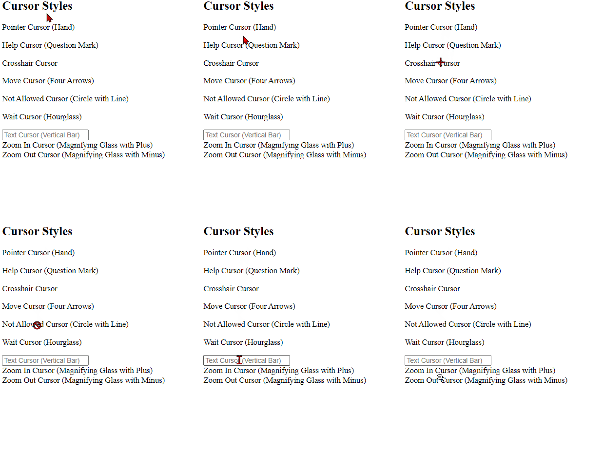
In this HTML file:
- We define various CSS classes (e.g.,
.pointer-cursor,.help-cursor) to set different cursor styles using thecursorproperty. - Inside the
<body>, we have various elements (e.g.,<p>,<input>,<div>) with these classes applied to them to demonstrate the different cursor styles.
When you open this HTML file in a web browser, you will see different elements with different cursor styles associated with them. You can hover over each element to see how the cursor changes based on the defined styles.
You can apply the “cursor” property to various HTML elements using CSS to enhance user experience and provide visual feedback. For example, you might change the cursor to a pointer when hovering over a “Submit” button to indicate that it’s clickable, or use a “not-allowed” cursor on a disabled button to show that it can’t be interacted with.
Related posts:

Powered by YARPP.