CSS Filters – Text and Image Effects
In CSS, “filters” are a versatile feature used to apply various visual effects to both text and images on web pages. These effects can enhance the aesthetics of a website and create engaging user experiences. Here are some common CSS filter effects:
For Text:
- Text Shadow: You can use the “text-shadow” property to add a shadow to text, creating depth and making it stand out from the background.
- Text Glow: By combining “text-shadow” with a larger blur radius, you can achieve a glowing effect around text elements.
For Images:
- Grayscale: The “filter: grayscale()” property can turn color images into grayscale, creating a classic or monochromatic look.
- Blur: Applying “filter: blur()” can blur an image or text element, useful for creating soft backgrounds or simulating depth of field.
- Brightness: “filter: brightness()” adjusts the overall brightness of an element, making it brighter or darker.
- Contrast: The “filter: contrast()” property alters the contrast of an element, enhancing or reducing the difference between light and dark areas.
- Saturate: “filter: saturate()” controls the saturation of an element, making colors more or less vibrant.
- Hue Rotate: You can use “filter: hue-rotate()” to shift the hue of an image, creating various color effects.
- Invert: Applying “filter: invert()” can invert the colors of an element, creating a negative image effect.
- Opacity: The “opacity” property allows you to control the transparency of an element, making it partially see-through.
- Sepia: “filter: sepia()” adds a sepia tone to an element, giving it a vintage or nostalgic appearance.
- Drop Shadow: You can create drop shadows for images or text using the “box-shadow” property, which adds depth and dimension.
Example :
CSS filters allow you to apply various visual effects to text and images in HTML. Here’s an example that demonstrates some CSS filter effects applied to both text and images in an HTML document:
<!DOCTYPE html>
<html>
<head>
<style>
/* Regular CSS styles for the body */
body {
font-family: Arial, sans-serif;
background-color: #f0f0f0;
color: #333;
margin: 0;
padding: 0;
font-size: 16px;
}
/* CSS styles for text and image effects using filters */
.text-with-filters {
font-size: 24px;
color: #336699;
text-shadow: 2px 2px 2px rgba(0, 0, 0, 0.5);
filter: grayscale(30%); /* Apply grayscale filter to text */
}
.image-with-filters {
width: 300px;
height: 200px;
background-image: url('example-image.jpg');
background-size: cover;
filter: brightness(150%) contrast(120%) blur(3px); /* Apply multiple filters to the image */
}
</style>
</head>
<body>
<h2>CSS Filters Example</h2>
<!-- Text with filters -->
<p class="text-with-filters">This is text with CSS filters applied. It's grayscale and has a text shadow.</p>
<!-- Image with filters -->
<div class="image-with-filters"></div>
</body>
</html>Code language: HTML, XML (xml)Output :
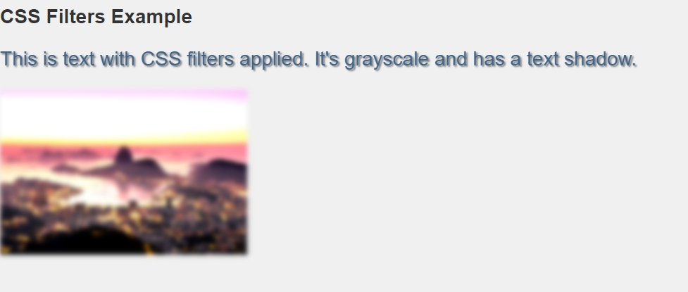
In this example:
- We have a basic HTML document with a heading (
<h2>), a paragraph (<p>), and a<div>element for displaying an image. - Inside the
<style>element, we define regular CSS styles for thebody, including font family, background color, text color, and font size. - We define CSS styles for text and image effects using CSS filters:
- The
.text-with-filtersclass applies a larger font size, changes the text color, adds a text shadow, and applies a grayscale filter to the text. - The
.image-with-filtersclass sets the size and background image of the<div>element, and applies multiple filters to the image, including brightness, contrast, and blur.
When you open this HTML file in a web browser, you will see text with grayscale and shadow effects, as well as an image with brightness, contrast, and blur effects applied. These are examples of how CSS filters can be used to create various visual effects for text and images. Make sure to replace ‘example-image.jpg’ with the actual path to your image file.
These CSS filter effects provide designers and developers with a wide range of tools to create visually appealing and dynamic web content. By applying filters, you can achieve various artistic, thematic, or interactive effects to enhance the overall user experience on a website.
