CSS – Media Types
In CSS, “media types” are a way to define how styles should be applied to different types of devices or media when rendering a web page. They allow web designers and developers to create responsive designs that adapt to various output methods and devices. Here are some common CSS media types:
- All: The “all” media type applies to all devices and is the default value. Styles defined under “all” are used for all media types unless overridden.
- Screen: The “screen” media type is used for devices with screens, such as desktop computers, laptops, tablets, and smartphones. It’s commonly used for standard web page styles.
- Print: The “print” media type is used for styles that are applied when a web page is printed. It allows designers to create printer-friendly layouts and hide unnecessary content.
- Speech: The “speech” media type is intended for screen readers and other speech synthesis devices, making web content accessible to visually impaired users.
- Aural: The “aural” media type was originally designed for speech synthesizers but has largely been replaced by the “speech” media type in modern CSS.
- Braille: The “braille” media type was designed for Braille tactile devices, enabling web content to be presented in a format suitable for Braille readers.
- Handheld: The “handheld” media type was used for early handheld devices but has become less relevant with the proliferation of responsive design techniques.
Example :
CSS media types allow you to apply different styles to different types of devices or media, such as screens, printers, or speech synthesizers. Here’s an example that demonstrates the use of CSS media types in an HTML document:
<!DOCTYPE html>
<html>
<head>
<style>
/* Common CSS styles for all media types */
body {
font-family: Arial, sans-serif;
font-size: 16px;
}
/* Styles for screens (default media type) */
@media screen {
body {
background-color: #f0f0f0;
color: #333;
}
h2 {
color: #336699;
}
}
/* Styles for print media */
@media print {
body {
background-color: #fff; /* White background for printing */
color: #000; /* Black text for printing */
}
h2 {
color: #000; /* Black heading color for printing */
}
}
</style>
</head>
<body>
<h2>CSS Media Types Example</h2>
<p>This is a simple HTML document that demonstrates the use of CSS media types to apply different styles for screens and print media.</p>
</body>
</html>Code language: HTML, XML (xml)Output :
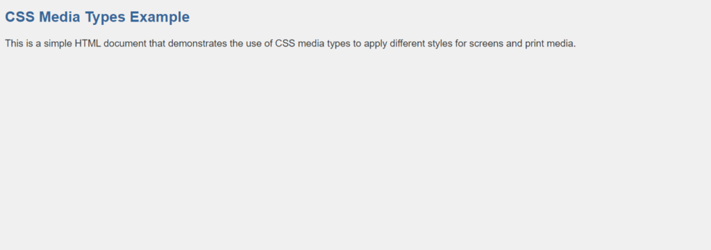
In this example:
- We have an HTML document with a heading (
<h2>) and a paragraph (<p>). - Inside the
<style>element, we define common CSS styles for all media types, such as font family and font size. - We use the
@mediarule to define styles for specific media types: - For the
screenmedia type (the default for most web browsers), we set a background color, text color, and heading color. - For the
printmedia type (used when printing the page), we set a different background color, text color, and heading color to optimize the page for printing.
When you view this HTML file in a web browser, you will see the styles specified for the screen media type. However, when you print the page, the styles specified for the print media type will be applied, resulting in a different appearance optimized for printing. This demonstrates how CSS media types can be used to control the presentation of content for different output devices.
Media types help designers create web pages that look and function optimally across a wide range of devices and use cases. By targeting specific media types, CSS styles can be tailored to provide the best user experience for each situation, whether it’s on a computer screen, in print, or via assistive technologies.
