CSS – Order
In CSS, the “order” property plays a crucial role in flexbox and grid layouts. It allows you to control the order in which elements appear on the screen, independently of their position in the HTML structure. This property is especially useful for creating responsive designs and rearranging content to suit different screen sizes or design preferences.
Let’s say you have a row of elements within a flexbox container, and you want to change the order in which they are displayed on a smaller screen. You can use the “order” property to achieve this. By assigning different numerical values to the “order” property of these elements, you can control their display order. Elements with lower “order” values appear first, and those with higher values appear later.
Here’s an example:
.flex-container {
display: flex;
flex-direction: row;
}
.flex-item1 {
order: 2;
}
.flex-item2 {
order: 1;
}
.flex-item3 {
order: 3;
}Code language: CSS (css)In this example, “flex-item1” will appear second, “flex-item2” will appear first, and “flex-item3” will appear third, even though they are in a different order in the HTML structure.
The “order” property provides flexibility in arranging elements, making it easier to create responsive designs and customize the layout of your web page to suit different devices and design goals.
<!DOCTYPE html>
<html>
<head>
    <style>
        /* CSS styles for the flex container */
        .flex-container {
            display: flex;
            flex-direction: row; /* Display flex items in a row */
        }

        /* CSS styles for the flex items with different orders */
        .flex-item {
            width: 100px;
            height: 100px;
            background-color: #336699;
            color: white;
            display: flex;
            align-items: center;
            justify-content: center;
            font-size: 18px;
            margin: 5px;
        }

        .item-1 { order: 3; } /* Display this item as the third */
        .item-2 { order: 1; } /* Display this item as the first */
        .item-3 { order: 2; } /* Display this item as the second */
    </style>
</head>
<body>
    <h2>Flexbox Order Example</h2>
    <div class="flex-container">
        <div class="flex-item item-1">Item 1</div>
        <div class="flex-item item-2">Item 2</div>
        <div class="flex-item item-3">Item 3</div>
    </div>
</body>
</html>Code language: HTML, XML (xml)
Output :
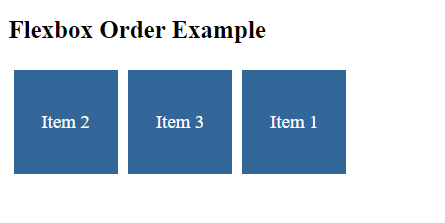
In this example:
- We have a flex container with the class
.flex-containerand three flex items with classes.flex-item,item-1,item-2, anditem-3. - In the CSS, we set the
displayproperty of the flex container toflexand useflex-direction: rowto display the flex items in a row. - We use the
orderproperty to control the order in which the flex items are displayed. In this example,item-1is given an order of3,item-2is given an order of1, anditem-3is given an order of2. - We also apply some styling to the flex items, such as setting their width, height, background color, and text color.
When you open this HTML file in a web browser, you will see that the flex items are displayed in the order specified by the order property, rather than the order in which they appear in the HTML markup. This demonstrates how the order property can be used to customize the order of flex items within a flex container.
CSS Order – Unset Value
The “unset” value for the “order” property is a way to revert an element’s order back to the default value, effectively removing any custom order you may have applied.
Here’s a practical example:
Suppose you have a navigation menu displayed as flex items, and you’ve set a custom order for one of the menu items to prioritize its position within the menu:
<div class="menu">
  <div class="menu-item">Home</div>
  <div class="menu-item special">Special Offer</div>
  <div class="menu-item">Products</div>
  <div class="menu-item">Contact</div>
</div>Code language: HTML, XML (xml)
In your CSS, you’ve defined a custom order for the “special” menu item:
.menu {
  display: flex;
}

.special {
  order: -1;
}Code language: CSS (css)
This arrangement places the “Special Offer” menu item at the beginning of the menu due to its negative order value.
Now, let’s say you want to remove this custom order and have the “Special Offer” menu item follow the natural order of the HTML structure. You can use the “unset” value for the “order” property like this:
.special {
  order: unset;
}Code language: CSS (css)
By setting the “order” property to “unset” for the “special” menu item, you effectively reset its order back to the default value, and it will follow the order specified in the HTML. This allows you to maintain flexibility in arranging your layout while selectively resetting specific elements to their default order when needed.
<!DOCTYPE html>
<html>
<head>
    <style>
        /* CSS styles for the flex container */
        .flex-container {
            display: flex;
            flex-direction: row; /* Display flex items in a row */
        }

        /* CSS styles for the flex items with different orders */
        .flex-item {
            width: 100px;
            height: 100px;
            background-color: #336699;
            color: white;
            display: flex;
            align-items: center;
            justify-content: center;
            font-size: 18px;
            margin: 5px;
        }

        .item-1 { order: 3; } /* Display this item as the third */
        .item-2 { order: 1; } /* Display this item as the first */
        .item-3 { order: unset; } /* Remove the order property and revert to default order */
    </style>
</head>
<body>
    <h2>Flexbox Order Unset Example</h2>
    <div class="flex-container">
        <div class="flex-item item-1">Item 1</div>
        <div class="flex-item item-2">Item 2</div>
        <div class="flex-item item-3">Item 3</div>
    </div>
</body>
</html>Code language: HTML, XML (xml)
Output :
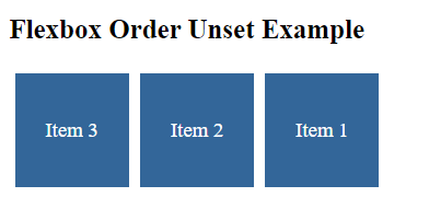
In this example:
- We have a flex container with the class
.flex-containerand three flex items with classes.flex-item,item-1,item-2, anditem-3. - In the CSS, we set the
displayproperty of the flex container toflexand useflex-direction: rowto display the flex items in a row. - We use the
orderproperty to control the order ofitem-1anditem-2.item-1is given an order of3, anditem-2is given an order of1. - For
item-3, we use theorderproperty with theunsetvalue to remove the order property, reverting it to its default order.
When you open this HTML file in a web browser, you will see that item-3 is displayed in its default order, which is based on the order in the HTML markup. This demonstrates how you can use the unset value to remove the order property and revert to the default order.
