CSS – Pseudo Classes
Certainly! In CSS, “pseudo-classes” are a powerful feature that allows you to select and style elements based on their state or position within the HTML document. Pseudo-classes start with a colon (:) and provide a way to apply styles to elements that cannot be targeted using regular class or ID selectors alone.
Here are some common pseudo-classes and their purposes:
1. :hover: This pseudo-class allows you to style an element when the mouse pointer is placed over it. It’s often used for interactive effects like button hover states.
Example :
In HTML and CSS, the :hover pseudo-class is used to apply styles to an element when a user hovers their mouse pointer over it. Here’s an example of how to use :hover in HTML and CSS:
<!DOCTYPE html>
<html>
<head>
<style>
/* CSS styles for the element */
.hover-element {
width: 200px;
height: 100px;
background-color: #336699;
color: white;
text-align: center;
line-height: 100px;
transition: background-color 0.3s; /* Add a smooth transition effect */
}
/* Apply styles when the element is hovered */
.hover-element:hover {
background-color: #ff6600; /* Change background color on hover */
}
</style>
</head>
<body>
<h2>:hover Example</h2>
<div class="hover-element">
Hover over me
</div>
</body>
</html>Code language: HTML, XML (xml)Output :
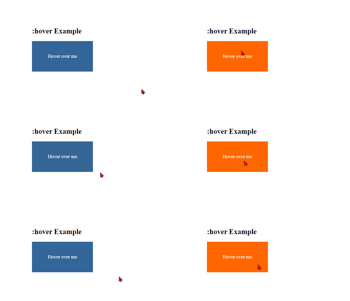
In this example:
- We have a
<div>element with the class.hover-element. - In the CSS, we use the
.hover-elementclass to set the default styles for the element, including its dimensions, background color, text color, and text alignment. - We use the
.hover-element:hoverselector to specify styles that should be applied when the element is hovered. In this case, we change the background color to a different color when the element is hovered. - We also include a
transitionproperty to add a smooth transition effect when the background color changes.
When you open this HTML file in a web browser and hover your mouse pointer over the <div>, you will see that the background color changes from the default color to the specified color, creating a hover effect. This demonstrates how the :hover pseudo-class can be used to apply styles when an element is hovered over by the user.
2. :active: It targets an element while it’s being activated or clicked, such as when a user clicks a button.
Example :
In HTML and CSS, the :active pseudo-class is used to apply styles to an element when it is actively being clicked or interacted with by a user. Here’s an example of how to use :active in HTML and CSS:
<!DOCTYPE html>
<html>
<head>
    <style>
        /* CSS styles for the element */
        .active-element {
            width: 200px;
            height: 100px;
            background-color: #336699;
            color: white;
            text-align: center;
            line-height: 100px;
            cursor: pointer; /* Change cursor on hover */
            transition: background-color 0.3s; /* Add a smooth transition effect */
        }

        /* Apply styles when the element is active (clicked) */
        .active-element:active {
            background-color: #ff6600; /* Change background color when clicked */
        }
    </style>
</head>
<body>
    <h2>:active Example</h2>
    <div class="active-element">
        Click me
    </div>
</body>
</html>Code language: HTML, XML (xml)
Output :
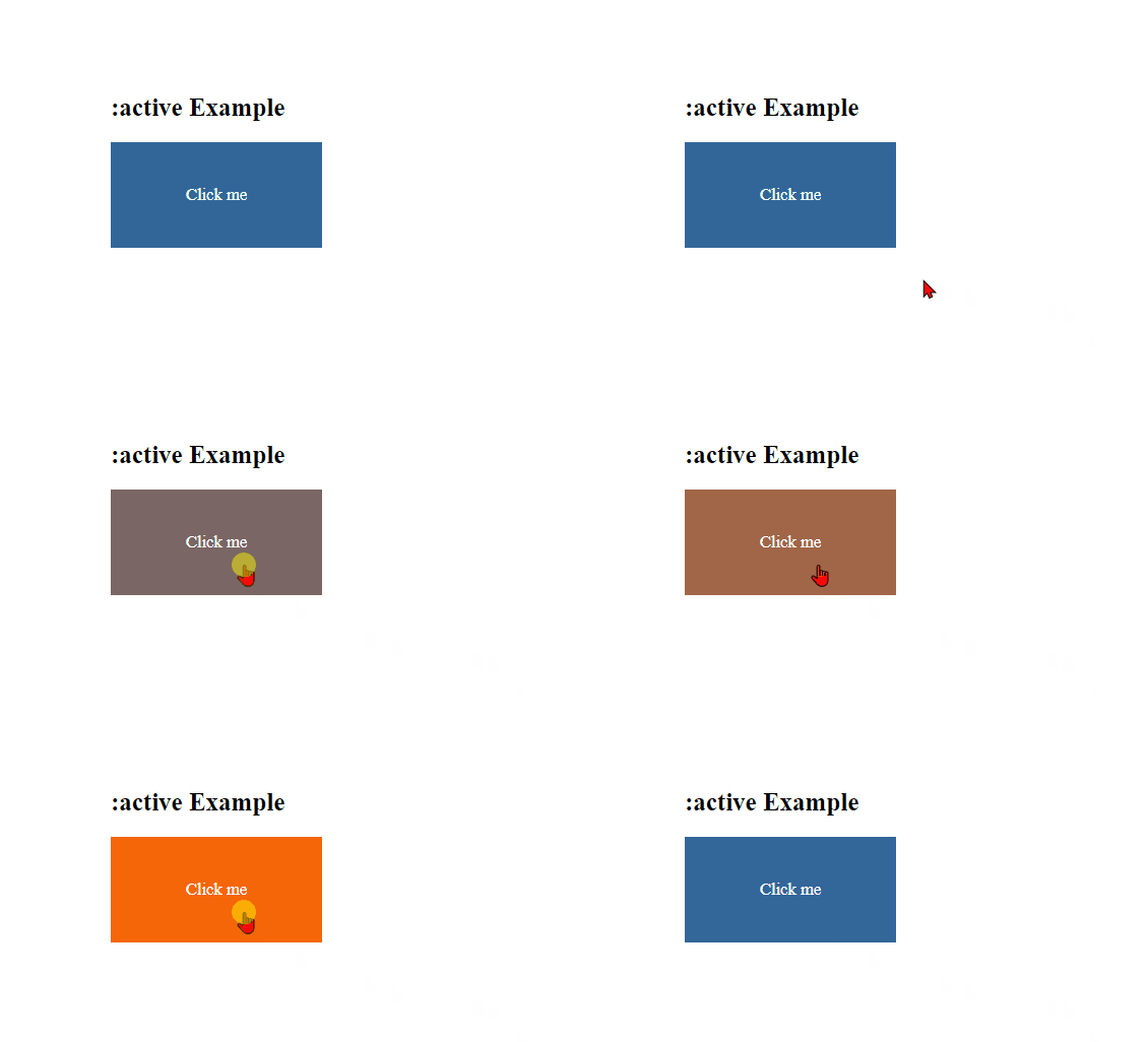
In this example:
- We have a
<div>element with the class.active-element. - In the CSS, we use the
.active-elementclass to set the default styles for the element, including its dimensions, background color, text color, text alignment, and cursor style. We also include atransitionproperty to add a smooth transition effect when the background color changes. - We use the
.active-element:activeselector to specify styles that should be applied when the element is actively clicked. In this case, we change the background color to a different color when the element is clicked.
When you open this HTML file in a web browser and click on the <div>, you will see that the background color changes from the default color to the specified color while the element is being clicked. This demonstrates how the :active pseudo-class can be used to apply styles when an element is actively interacted with by the user.
3. :focus: This pseudo-class selects an element that currently has keyboard or mouse focus, like input fields or links that are currently selected.
Example :
In HTML and CSS, the :focus pseudo-class is used to apply styles to an element when it gains focus, typically as a result of user interaction such as clicking or tabbing to the element. Here’s an example of how to use :focus in HTML and CSS:
<!DOCTYPE html>
<html>
<head>
    <style>
        /* CSS styles for the input element */
        .focus-element {
            width: 200px;
            height: 30px;
            border: 2px solid #336699;
            padding: 5px;
            font-size: 16px;
        }

        /* Apply styles when the input element is focused */
        .focus-element:focus {
            border-color: #ff6600; /* Change border color when focused */
            background-color: skyblue; /* Change background-color when focused */
        }
    </style>
</head>
<body>
    <h2>:focus Example</h2>
    <input type="text" class="focus-element" placeholder="Click here or tab to focus">
</body>
</html>Code language: HTML, XML (xml)
Output :
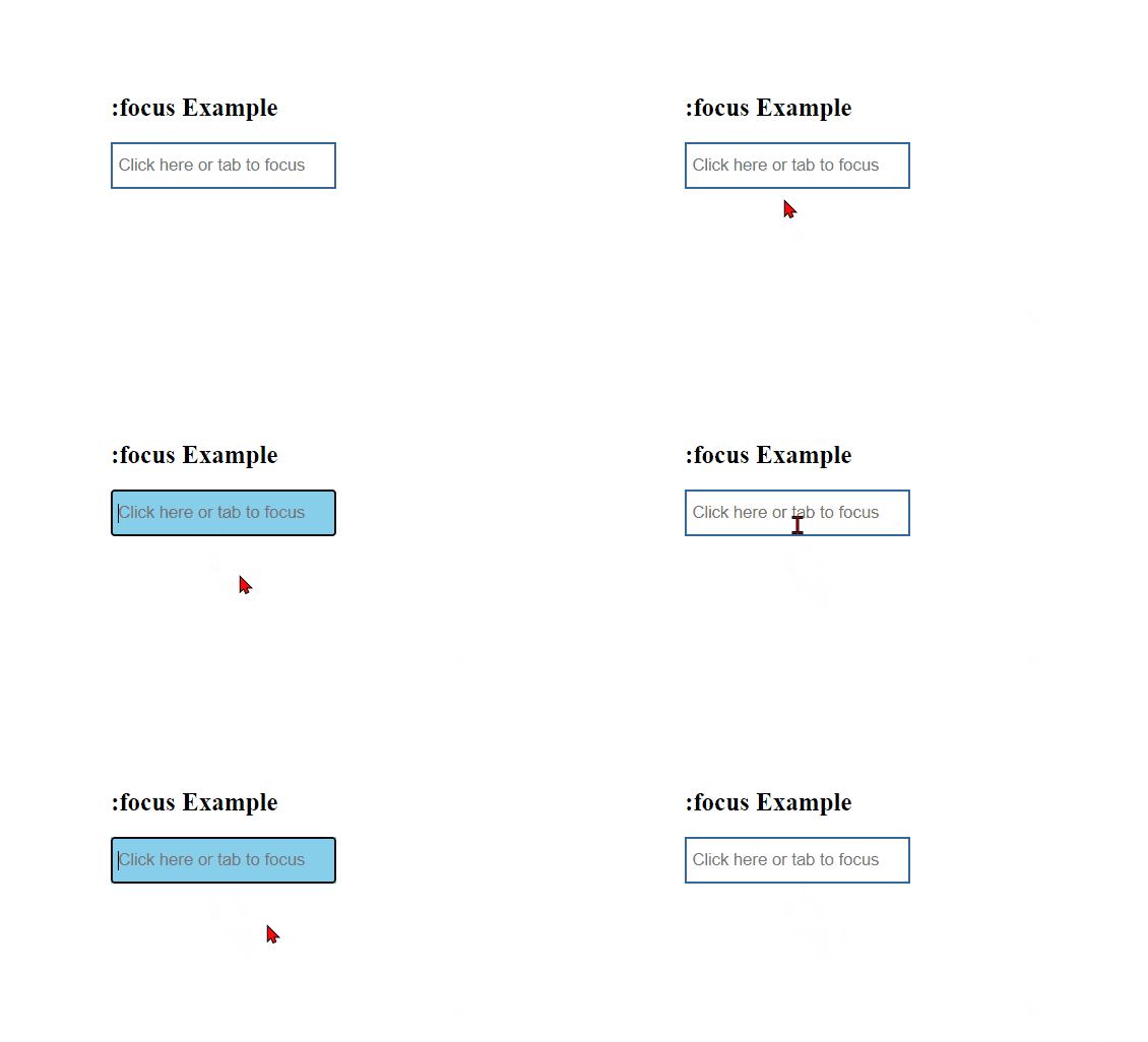
In this example:
- We have an
<input>element with thetype="text"attribute and the class.focus-element. - In the CSS, we use the
.focus-elementclass to set the default styles for the input element, including its dimensions, border, padding, and font size. - We use the
.focus-element:focusselector to specify styles that should be applied when the input element gains focus. In this case, we change the border color to a different color when the input element is focused.
When you open this HTML file in a web browser and click on the input element or tab to it, you will see that the border color changes from the default color to the specified color when the input element gains focus. This demonstrates how the :focus pseudo-class can be used to apply styles when an element is focused through user interaction.
4. :nth-child(): It allows you to select elements based on their position within a parent container. You can target every nth child element and apply specific styles, useful for creating alternating row colors in tables.
Example :
In HTML and CSS, the :nth-child() pseudo-class is used to select and style elements based on their position within a parent element. You can use different values within the parentheses to target specific child elements. Here’s an example of how to use :nth-child() in HTML and CSS:
<!DOCTYPE html>
<html>
<head>
    <style>
        /* CSS styles for list items */
        ul li {
            margin: 5px;
            padding: 10px;
            background-color: #336699;
            color: white;
        }

        /* Apply styles to every odd list item */
        ul li:nth-child(odd) {
            background-color: #ff6600;
        }

        /* Apply styles to every even list item */
        ul li:nth-child(even) {
            background-color: #99cc99;
        }
    </style>
</head>
<body>
    <h2>:nth-child() Example</h2>
    <ul>
        <li>Item 1</li>
        <li>Item 2</li>
        <li>Item 3</li>
        <li>Item 4</li>
        <li>Item 5</li>
    </ul>
</body>
</html>Code language: HTML, XML (xml)
Output :
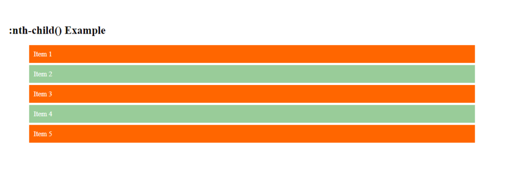
In this example:
- We have an unordered list (
<ul>) with five list items (<li>). - In the CSS, we use the
ul liselector to set the default styles for all list items, including margin, padding, background color, and text color. - We use
ul li:nth-child(odd)to select and apply styles to every odd list item, changing its background color to one color. - We use
ul li:nth-child(even)to select and apply styles to every even list item, changing its background color to another color.
When you open this HTML file in a web browser, you will see that the odd and even list items have different background colors, demonstrating how the :nth-child() pseudo-class can be used to select and style elements based on their position within a parent element.
5. :first-child and :last-child: These pseudo-classes select the first and last child elements of a parent, respectively.
Example
In HTML and CSS, the :first-child and :last-child pseudo-classes are used to select and style the first and last child elements within a parent element, respectively. Here’s an example of how to use :first-child and :last-child in HTML and CSS:
<!DOCTYPE html>
<html>
<head>
    <style>
        /* CSS styles for list items */
        ul li {
            margin: 5px;
            padding: 10px;
            background-color: #336699;
            color: white;
        }

        /* Apply styles to the first child */
        ul li:first-child {
            background-color: #ff6600;
        }

        /* Apply styles to the last child */
        ul li:last-child {
            background-color: #99cc99;
        }
    </style>
</head>
<body>
    <h2>:first-child and :last-child Example</h2>
    <ul>
        <li>First Item</li>
        <li>Second Item</li>
        <li>Third Item</li>
        <li>Last Item</li>
    </ul>
</body>
</html>Code language: HTML, XML (xml)
Output :
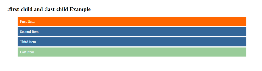
In this example:
- We have an unordered list (
<ul>) with four list items (<li>). - In the CSS, we use the
ul liselector to set the default styles for all list items, including margin, padding, background color, and text color. - We use
ul li:first-childto select and apply styles to the first list item, changing its background color to one color. - We use
ul li:last-childto select and apply styles to the last list item, changing its background color to another color.
When you open this HTML file in a web browser, you will see that the first and last list items have different background colors, demonstrating how the :first-child and :last-child pseudo-classes can be used to select and style the first and last child elements within a parent element.
6. :not(): You can use this pseudo-class to select elements that do not match a particular selector. It’s handy for excluding specific elements from styling.
Example :
In HTML and CSS, the :not() pseudo-class is used to select and style elements that do not match a specified selector. This allows you to exclude certain elements from being styled. Here’s an example of how to use :not() in HTML and CSS:
<!DOCTYPE html>
<html>
<head>
    <style>
        /* CSS styles for all list items */
        ul li {
            margin: 5px;
            padding: 10px;
            background-color: #336699;
            color: white;
        }

        /* Apply styles to all list items except the first one */
        ul li:not(:first-child) {
            background-color: #ff6600;
        }
    </style>
</head>
<body>
    <h2>:not() Example</h2>
    <ul>
        <li>First Item</li>
        <li>Second Item</li>
        <li>Third Item</li>
        <li>Fourth Item</li>
    </ul>
</body>
</html>Code language: HTML, XML (xml)
Output :
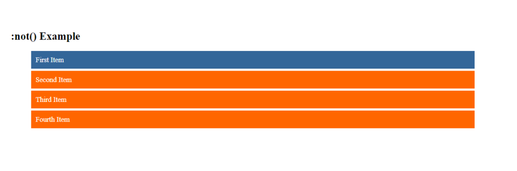
In this example:
- We have an unordered list (
<ul>) with four list items (<li>). - In the CSS, we use the
ul liselector to set the default styles for all list items, including margin, padding, background color, and text color. - We use
ul li:not(:first-child)to select and apply styles to all list items except the first one. This selector excludes the first child (:first-child) from being styled with the background color.
When you open this HTML file in a web browser, you will see that all list items except the first one have a different background color, demonstrating how the :not() pseudo-class can be used to select and style elements that do not match a specified selector.
7. :checked: It selects input elements like checkboxes or radio buttons that are checked. You can style these elements to provide visual feedback to users.
Example :
In HTML and CSS, the :checked pseudo-class is used to select and style form elements, such as radio buttons and checkboxes, that have been checked by the user. This is commonly used to apply styles to checked elements to provide visual feedback. Here’s an example of how to use :checked in HTML and CSS:
<!DOCTYPE html>
<html>
<head>
    <style>
        /* CSS styles for the label and checkbox */
        .checkbox-label {
            display: block;
            margin-bottom: 10px;
        }

        .checkbox-input {
            display: none; /* Hide the actual checkbox input */
        }

        /* Apply styles to the label when the checkbox is checked */
        .checkbox-input:checked + .checkbox-label {
            background-color: #ff6600;
            color: white;
        }
    </style>
</head>
<body>
    <h2>:checked Example</h2>

    <!-- Checkbox 1 -->
    <input type="checkbox" class="checkbox-input" id="checkbox1">
    <label for="checkbox1" class="checkbox-label">Checkbox 1</label>

    <!-- Checkbox 2 -->
    <input type="checkbox" class="checkbox-input" id="checkbox2">
    <label for="checkbox2" class="checkbox-label">Checkbox 2</label>
</body>
</html>Code language: HTML, XML (xml)
Output :
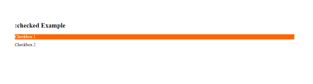
In this example:
- We have two checkboxes, each followed by a
<label>element with aforattribute that matches theidof the associated checkbox. This allows users to click the label to toggle the checkbox. - In the CSS, we style the labels and hide the actual checkbox inputs using the
.checkbox-labeland.checkbox-inputclasses. - We use the
.checkbox-input:checked + .checkbox-labelselector to select and apply styles to the label when the checkbox is checked. In this case, we change the background color and text color of the label to provide visual feedback.
When you open this HTML file in a web browser and check the checkboxes by clicking on their labels, you will see that the labels change their background color and text color to indicate that the checkboxes are checked. This demonstrates how the :checked pseudo-class can be used to select and style form elements that have been checked by the user.
8. :before and :after: These pseudo-classes target the content inserted before and after an element, often used for adding decorative elements or icons.
Example :
In HTML and CSS, the ::before and ::after pseudo-elements are used to insert content before and after an element, respectively. These pseudo-elements are often used for decorative purposes or to add additional content to elements without modifying the HTML structure. Here’s an example of how to use ::before and ::after in HTML and CSS:
<!DOCTYPE html>
<html>
<head>
    <style>
        /* CSS styles for the container div */
        .container {
            width: 300px;
            height: 150px;
            background-color: #336699;
            color: white;
            text-align: center;
            line-height: 150px;
            position: relative;
        }

        /* Style the ::before pseudo-element */
        .container::before {
            content: "Before";
            background-color: #ff6600;
            position: absolute;
            top: 0;
            left: 0;
            width: 50%;
            height: 100%;
            text-align: center;
            line-height: 150px;
        }

        /* Style the ::after pseudo-element */
        .container::after {
            content: "After";
            background-color: #99cc99;
            position: absolute;
            top: 0;
            right: 0;
            width: 50%;
            height: 100%;
            text-align: center;
            line-height: 150px;
        }
    </style>
</head>
<body>
    <h2>::before and ::after Example</h2>
    <div class="container">Content</div>
</body>
</html>Code language: HTML, XML (xml)
Output :
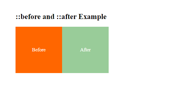
In this example:
- We have a
<div>element with the class.containerthat serves as a container for our example. - In the CSS, we set the default styles for the container, including its dimensions, background color, text color, and alignment.
- We use the
.container::beforepseudo-element to insert content before the container. This content is specified using thecontentproperty and is styled with its own background color, position, and dimensions. - Similarly, we use the
.container::afterpseudo-element to insert content after the container. It also has its own content, background color, position, and dimensions.
When you open this HTML file in a web browser, you will see that the container has content inserted before and after it using the ::before and ::after pseudo-elements. This demonstrates how you can use these pseudo-elements to add decorative or additional content to elements in your HTML document.
Pseudo-classes are a valuable tool for creating interactive and responsive web designs. They allow you to apply styles to elements based on user interactions or their position in the DOM, enhancing the user experience and providing a wide range of styling possibilities.
